City of Doncaster
Re-imagining Doncaster Council for a modern future.
City of Doncaster
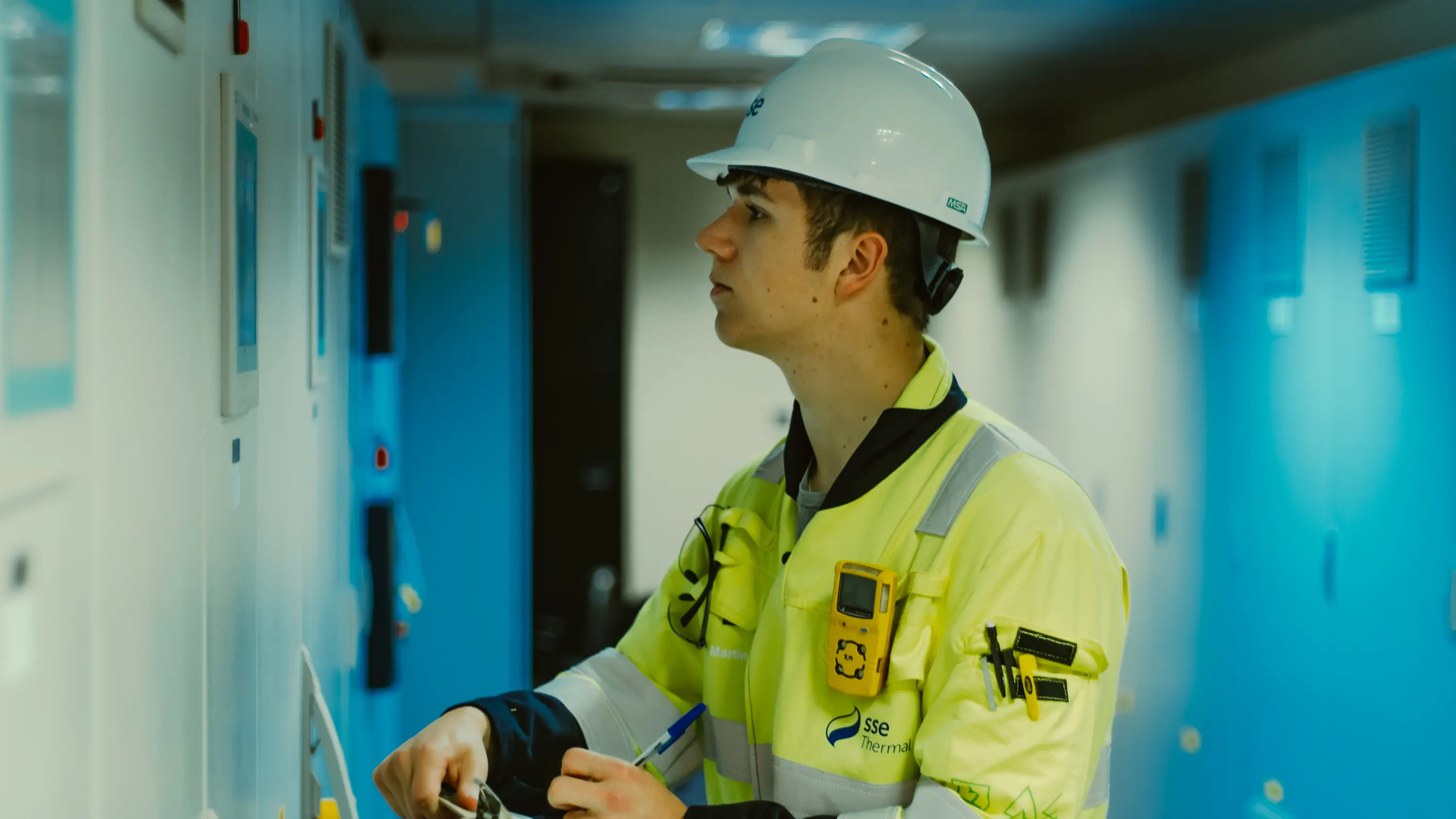
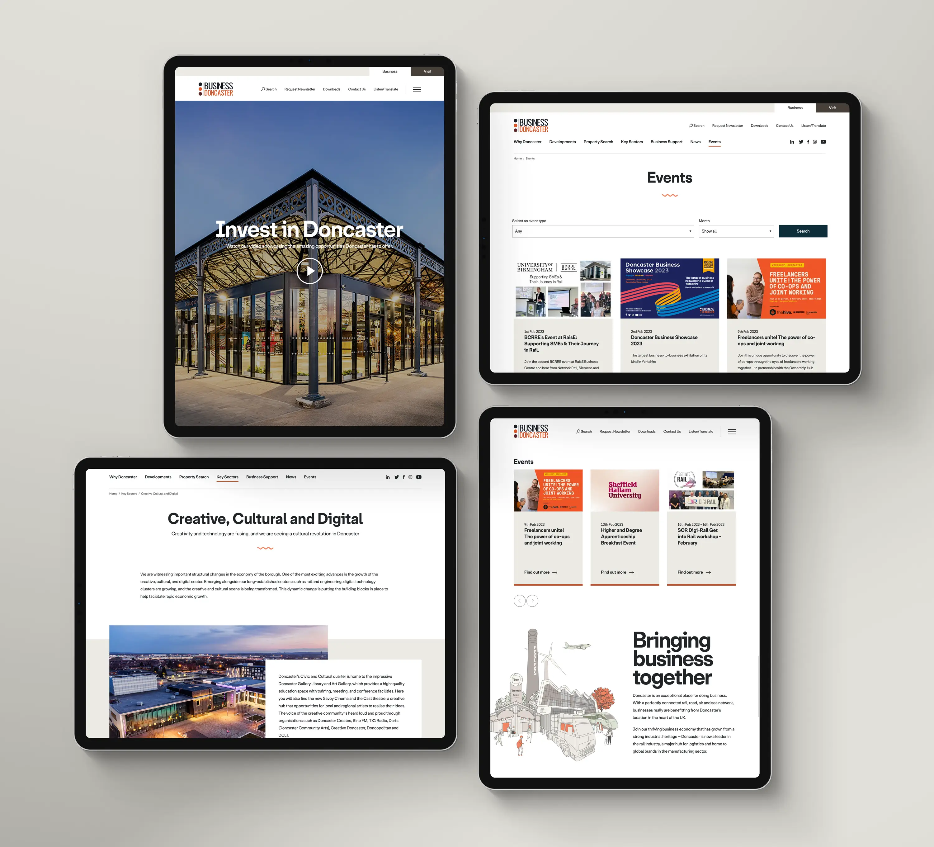
We’ve been fortunate to collaborate with key individuals at Doncaster Council. Our work has included redesigning the Visit Doncaster and Business Doncaster websites, supporting the Advance Employment Hub in educating and guiding the future workforce, keeping Doncaster active, and helping people discover the best cup of coffee at Café 1910. We're proud to be associated with the newest city in the UK.
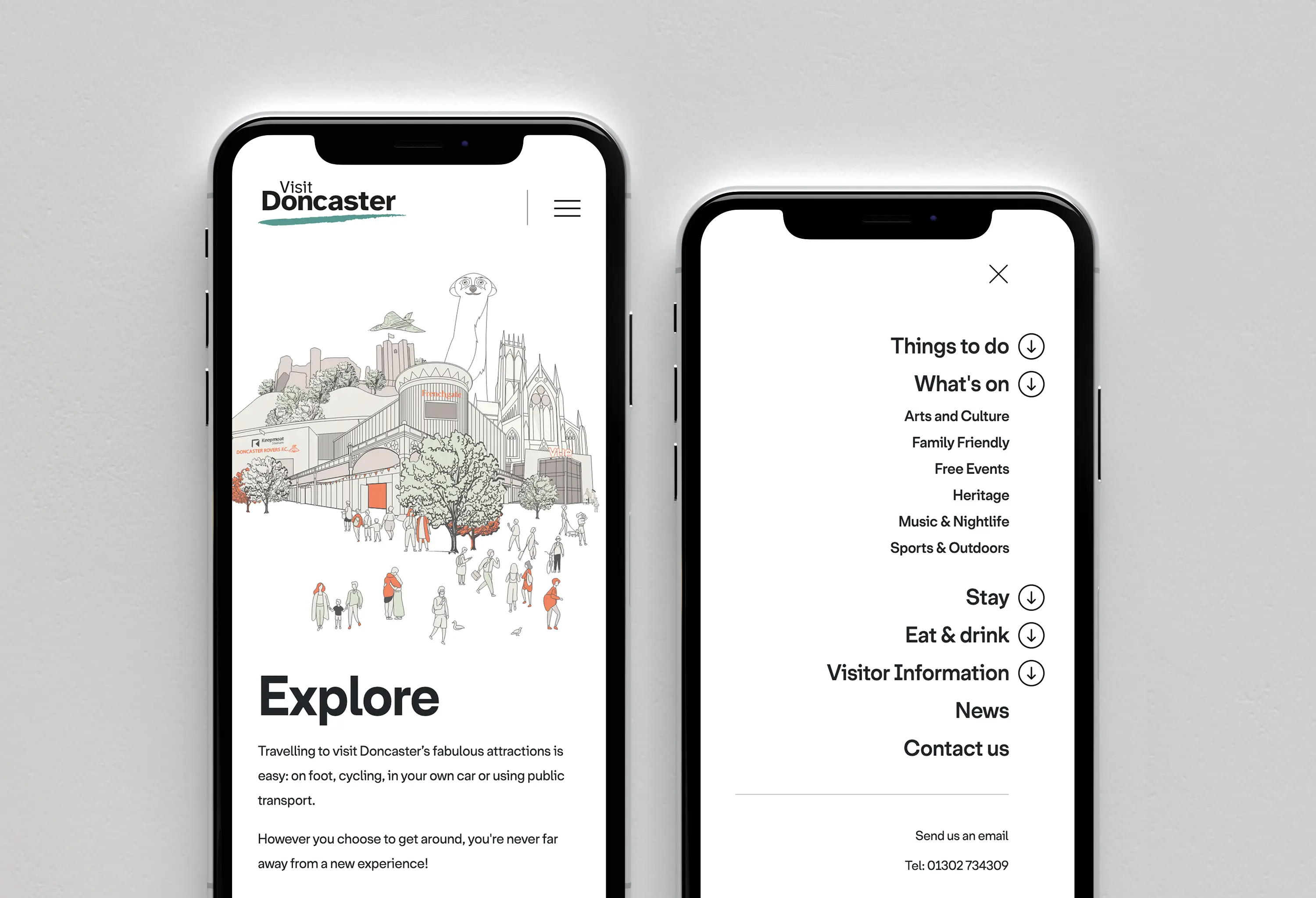
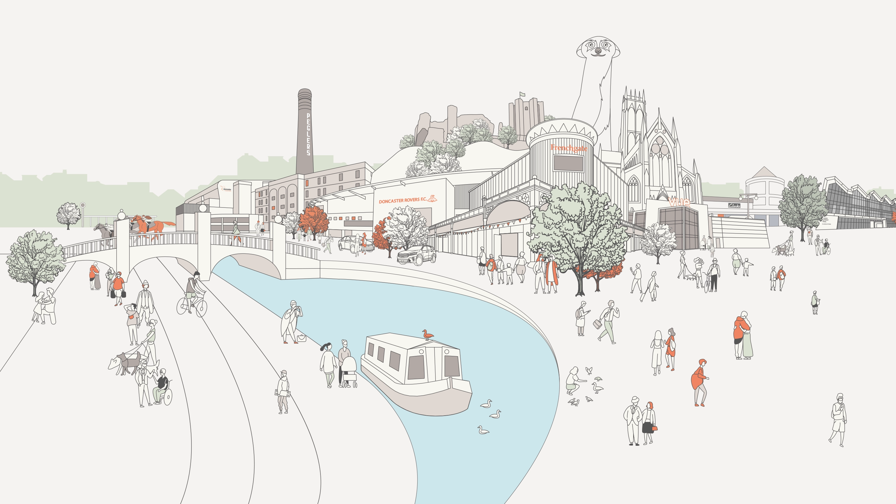
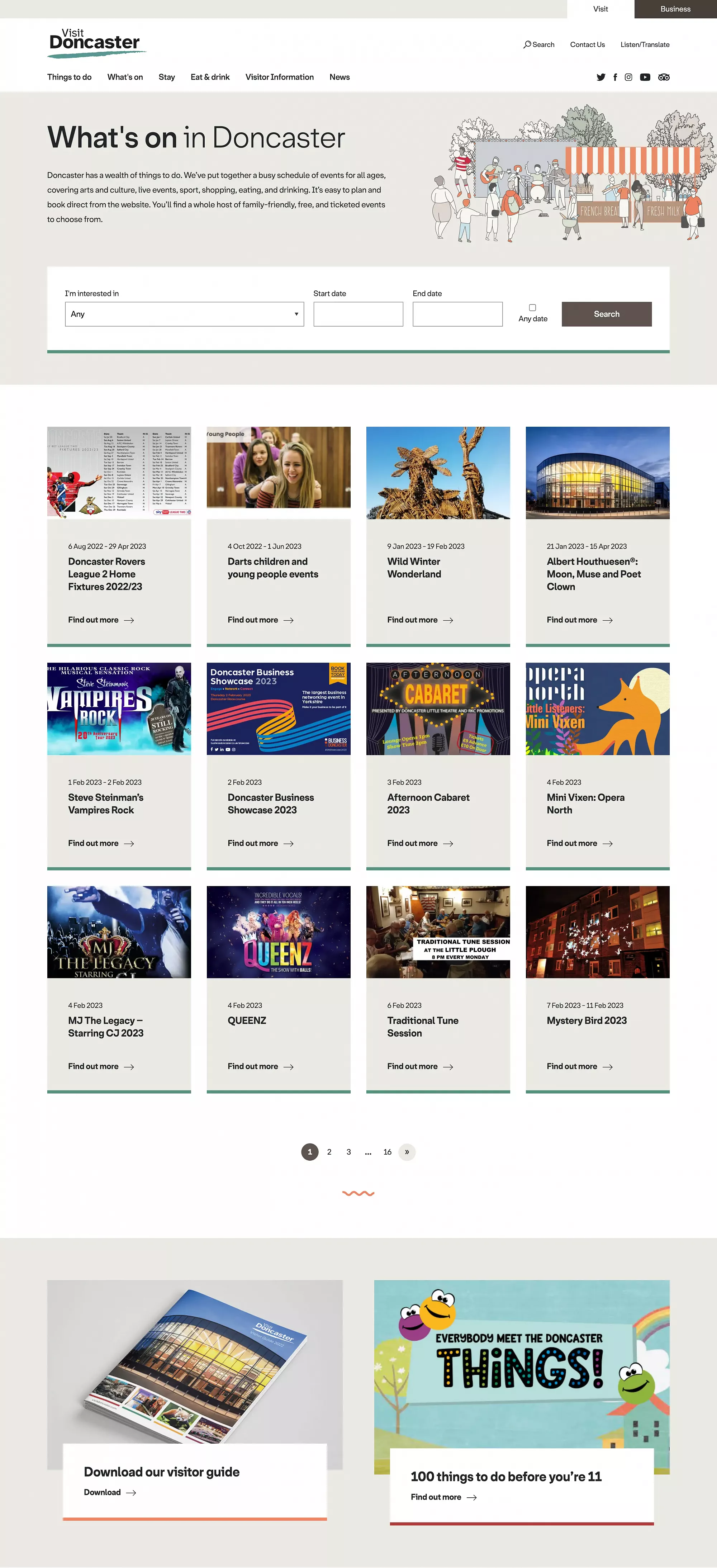
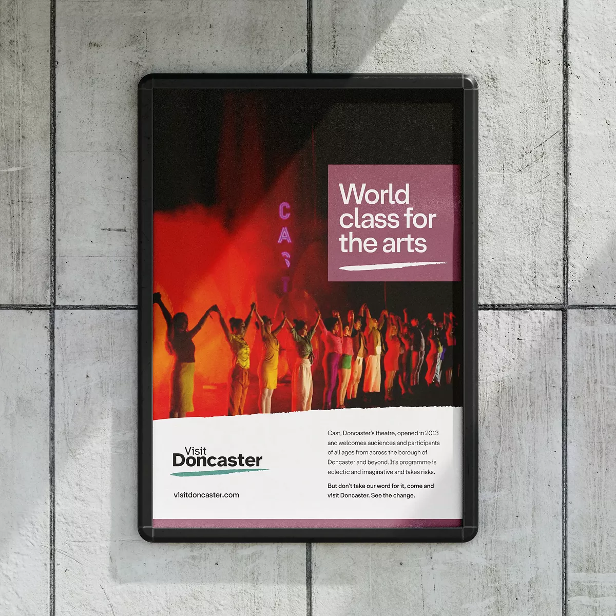
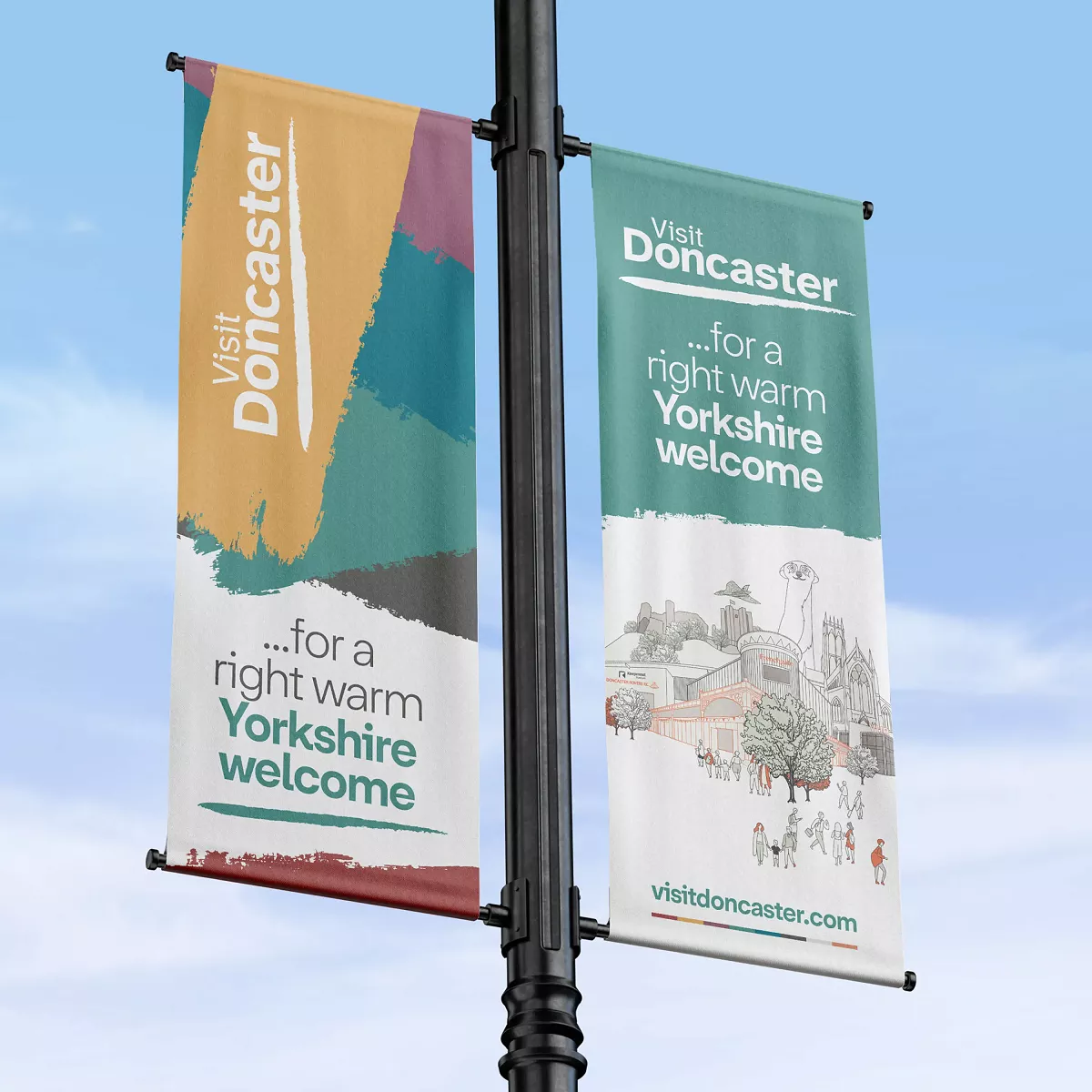
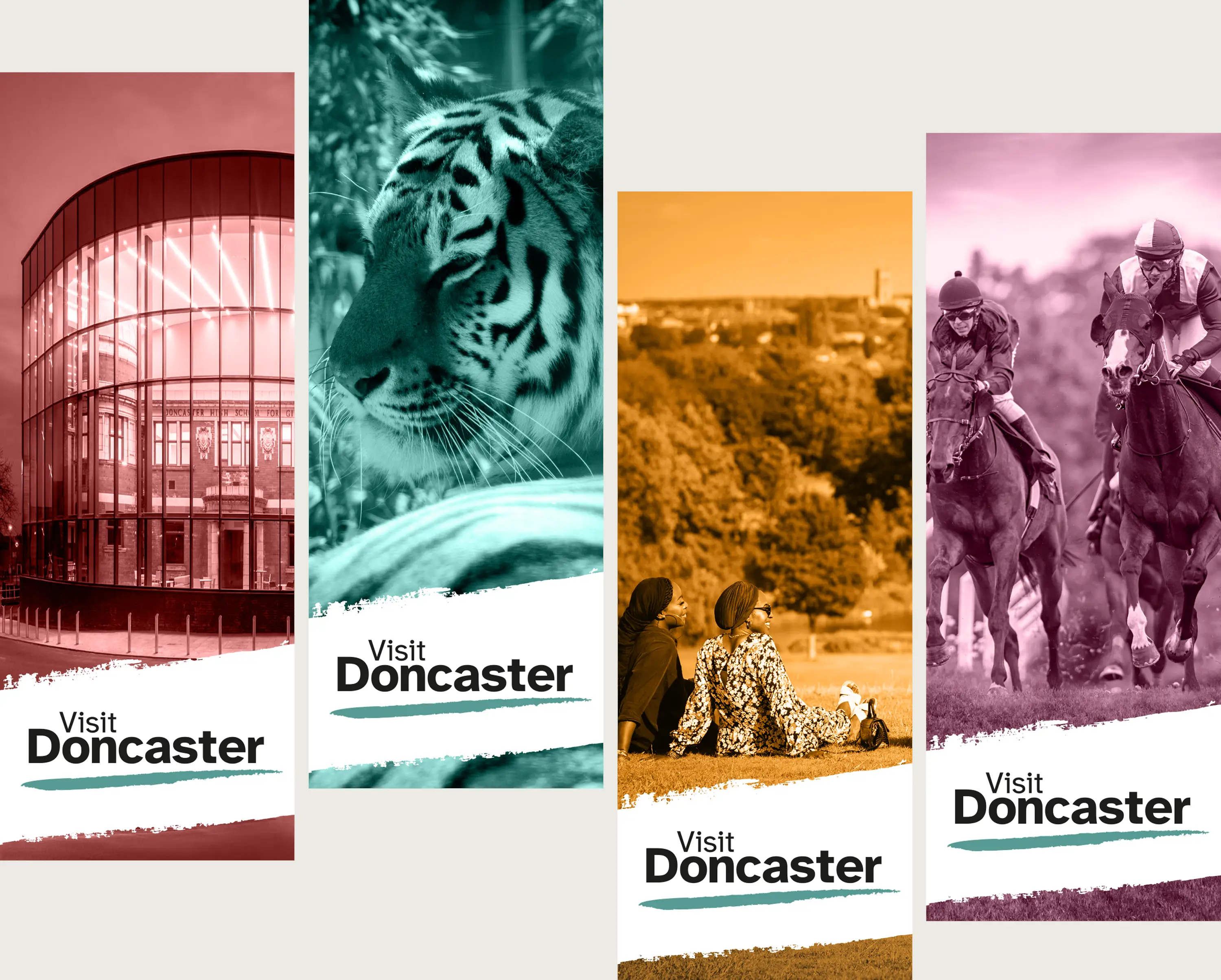
Transforming Visit Doncaster: A Bold New Look and User Experience
The redesign of the Visit Doncaster modernised the website with a more user-friendly interface and engaging visuals. The layout was simplified, featuring an interactive homepage and easier navigation to showcase local attractions. The website includes event updates and mobile optimisation, ensuring a smoother browsing experience. The update improved accessibility, allowing visitors to easily explore things to do, places to eat, and accommodation options in Doncaster, all while providing a more seamless, enjoyable experience for users.
One of the most important aspects of any website is its accessibility.
Open to everyone regardless of their impairment which is why we researched several typefaces and finally chose Friends and now used for both online and offline marketing, specifically made for low vision readers who have trouble distinguishing certain letters and numbers.


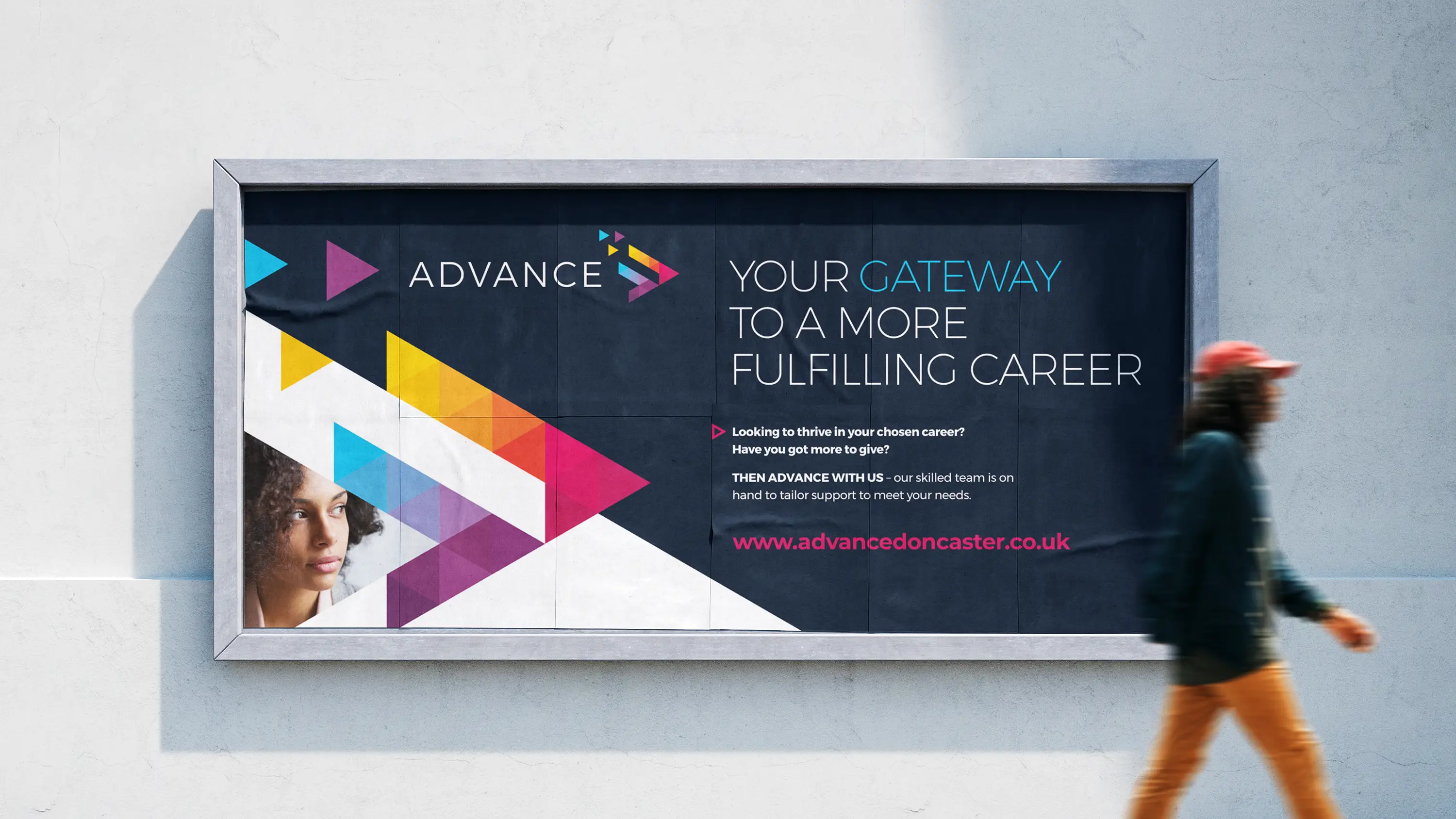
The Advance Employment Hub brand has evolved over the years and was so successful that it has now been extended to Rotherham, Sheffield and Barnsley, in essence Advance is there to help the local workforce to find and hopefully send them on a path for a more fulfilling career.


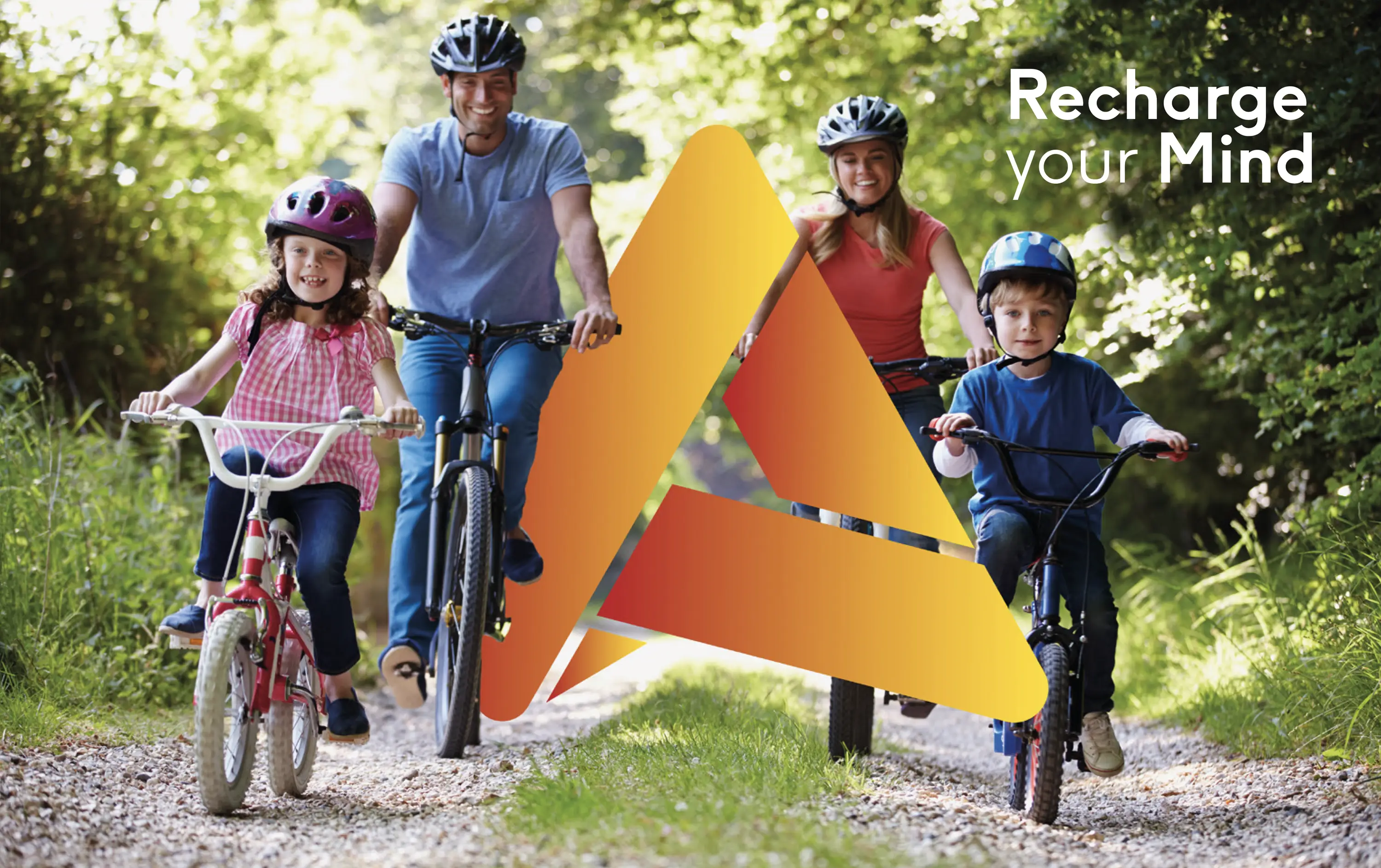
Gearing Doncaster’s communities to a healthier way of life, getting them out and about, with free access to cycles for young and old, printed maps to show them the best and safe trails to explore in Doncaster.


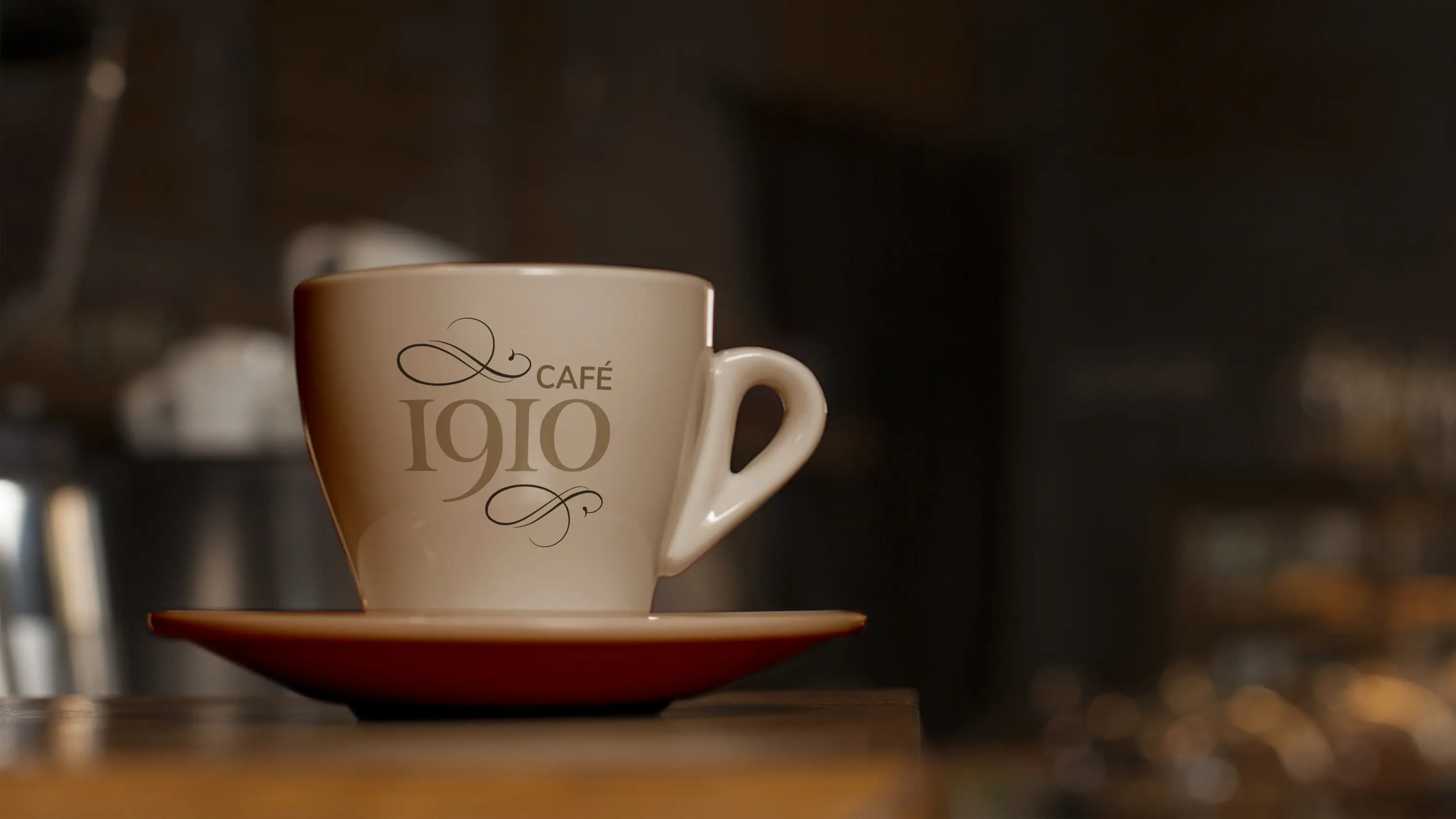
With the fantastic conversion of the old Doncaster girls high school nearing completion we were tasked with branding the new café which would be a focal point for visitors to the library and museum with a relatively small budget.
We presented several ideas but all agreed it should have a connection with the past, hence the name 1910 (the originally year the school was built) and the lovely serif font and flourishes to compliment the surroundings.