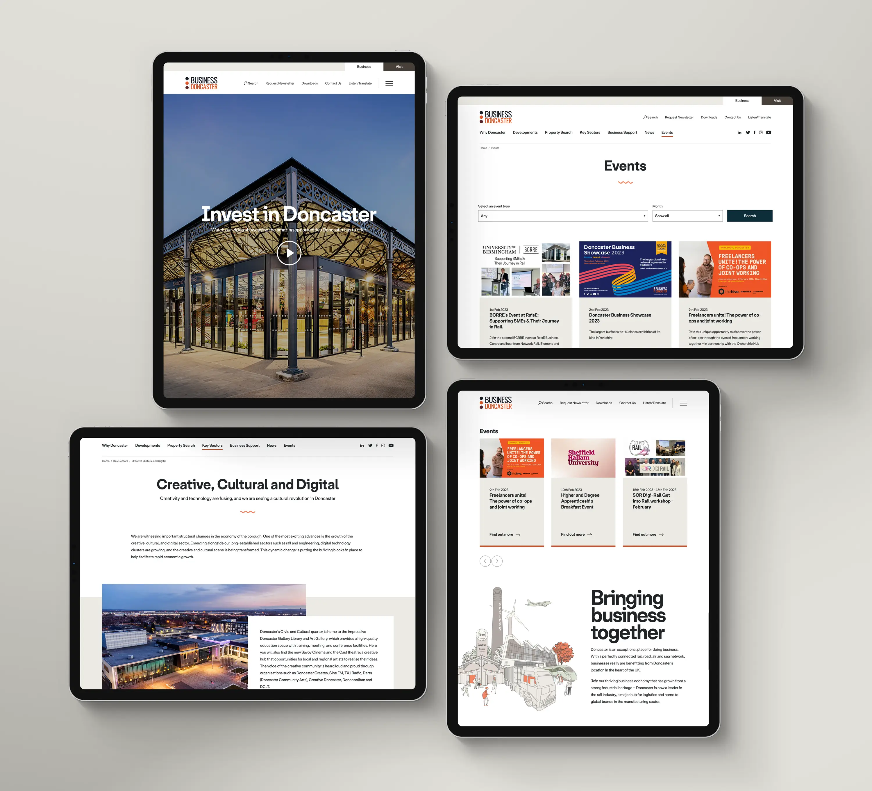

The previous site was complicated, hard to find anything and just too busy, the council wanted a totally new look and feel which we gave them in spades.
A clean fresh look with a nice limited colour palette so as not to confuse the user, add into that, best in class accessibility and an updated content management system that’s so easy for the council staff to update on a daily basis and you have a winning combination.
As part of the project we also designed and created a new branding guide to incorporate the new palette, visual imagery and illustrations which feature in this site and its sister site, Visit Doncaster which we’ve also design and created.